In today’s data-driven world, understanding stock market trends is crucial for making informed investment decisions. In this blog post, we'll walk through a Python script that downloads, analyzes, and visualizes the stock data of Toyota Motor Corporation using popular libraries such as yfinance, matplotlib, seaborn, and pandas.
Getting Started
Before we get into the code, make sure that you have installed the necessary libraries.
You can do this by running the following commands in your terminal:
CODE:-
install yfinance matplotlib seaborn pandasExplanation of Library Imports
yfinance
Purpose: This library allows you to easily download historical stock data from yahoo Finance.
matplotlib:
Purpose:matplotlib is a library used for creating static and animated visulizations in Python.
seaborn:
Purpose:Built top of matplotlib, seaborn is a statistical data visulization library.
pandas:
Purpose:pandas is a data analysis library. It provides data structures like DataFrames that allow you to efficiently store and manipulate large datasets.
The Full Code
Here's the complete code
 import yfinance as yf
 import matplotlib.pyplot as plt
 import pandas as pd
 import seaborn as sns

 # Download stock data for Toyota
 stock_symbol = 'TM'  # Toyota Motor Corporation ticker symbol
 start_date = '2020-01-01'
 end_date = '2024-10-11'
 stock_data = yf.download(stock_symbol, start=start_date, end=end_date)

 # Moving Averages
 stock_data['MA50'] = stock_data['Close'].rolling(window=50).mean()
 stock_data['MA200'] = stock_data['Close'].rolling(window=200).mean()

 # Plot Closing Price with Moving Averages
 plt.figure(figsize=(10, 6))
 plt.plot(stock_data['Close'], label='Close Price')
 plt.plot(stock_data['MA50'], label='50-Day Moving Average', linestyle='--')
 plt.plot(stock_data['MA200'], label='200-Day Moving Average', linestyle='--')
 plt.title(f'{stock_symbol} Stock Price with Moving Averages')
 plt.xlabel('Date')
 plt.ylabel('Price (USD)')
 plt.legend()

 # Daily Returns
 stock_data['Daily Return'] = stock_data['Close'].pct_change()
 plt.figure(figsize=(10, 6))
 sns.histplot(stock_data['Daily Return'].dropna(), bins=100, color='green')
 plt.title(f'{stock_symbol} Daily Returns Distribution')
 plt.xlabel('Daily Return')
 plt.ylabel('Frequency')

 # Cumulative Returns
 stock_data['Cumulative Return'] = (1 + stock_data['Daily Return']).cumprod()
 plt.figure(figsize=(10, 6))
 plt.plot(stock_data['Cumulative Return'], label='Cumulative Return', color='orange')
 plt.title(f'{stock_symbol} Cumulative Returns Over Time')
 plt.xlabel('Date')
 plt.ylabel('Cumulative Return')
 plt.legend()
 plt.show()
Step 1: Importing Libraries
We begin by importing the necessary libraries:
python
import yfinance as yf import matplotlib.pyplot as plt import pandas as pd import seaborn as sns
Step 2: Downloading Stock Data
Let's download Toyota's stock data from 2020-01-01 to 2024-10-11
python
stock_symbol = 'TM' # Toyota Motor Corporation ticker symbol start_date = '2020-01-01' end_date = '2024-10-11' stock_data = yf.download(stock_symbol, start=start_date, end=end_date)
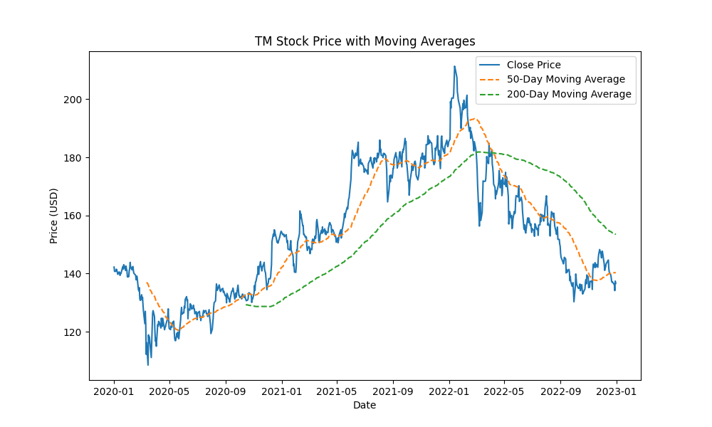
Step 3: Calculating Moving Average
Let's calculate the 50-200 days moving avarages, to get a undersdaing of the price trands
python
stock_data['MA50'] = stock_data['Close'].rolling(window=50).mean()
stock_data['MA200'] = stock_data['Close'].rolling(window=200).mean()
Step 4: Visualizing Closing Prices with Moving Avarages
Let’s visualize the stock's closing price along with its moving averages
python
plt.figure(figsize=(10, 6))
plt.plot(stock_data['Close'], label='Close Price')
plt.plot(stock_data['MA50'], label='50-Day Moving Average', linestyle='--')
plt.plot(stock_data['MA200'], label='200-Day Moving Average', linestyle='--')
plt.title(f'{stock_symbol} Stock Price with Moving Averages')
plt.xlabel('Date')
plt.ylabel('Price (USD)')
plt.legend()
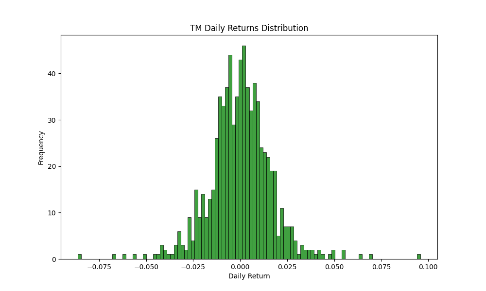
Step 5: Analizing Daily Returns
Analyzing how much the stock's price changes from one day to the next in order to assess how unpredictable or volatile the stock is
python
stock_data['Daily Return'] = stock_data['Close'].pct_change()
plt.figure(figsize=(10, 6))
sns.histplot(stock_data['Daily Return'].dropna(), bins=100, color='green')
plt.title(f'{stock_symbol} Daily Returns Distribution')
plt.xlabel('Daily Return')
plt.ylabel('Frequency')
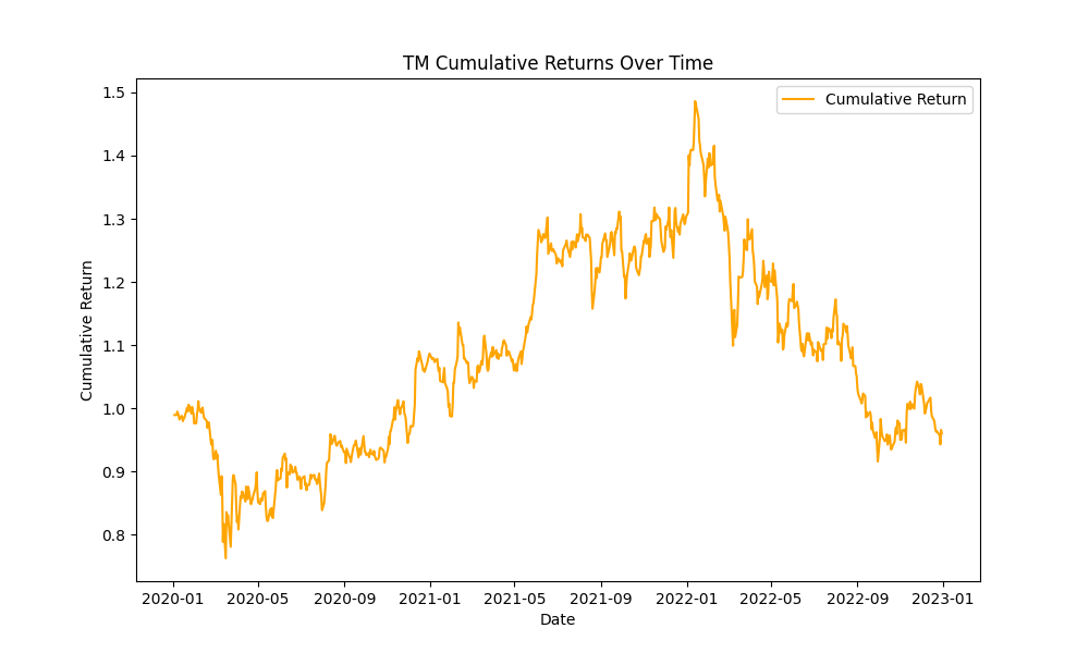
Step 6: Visualizing Cumulative Returns
Finally, we calculate and plot the cumulative returns to see how the stock has performed over time
python
stock_data['Cumulative Return'] = (1 + stock_data['Daily Return']).cumprod()
plt.figure(figsize=(10, 6))
plt.plot(stock_data['Cumulative Return'], label='Cumulative Return', color='orange')
plt.title(f'{stock_symbol} Cumulative Returns Over Time')
plt.xlabel('Date')
plt.ylabel('Cumulative Return')
plt.legend()
plt.show()